September 2020
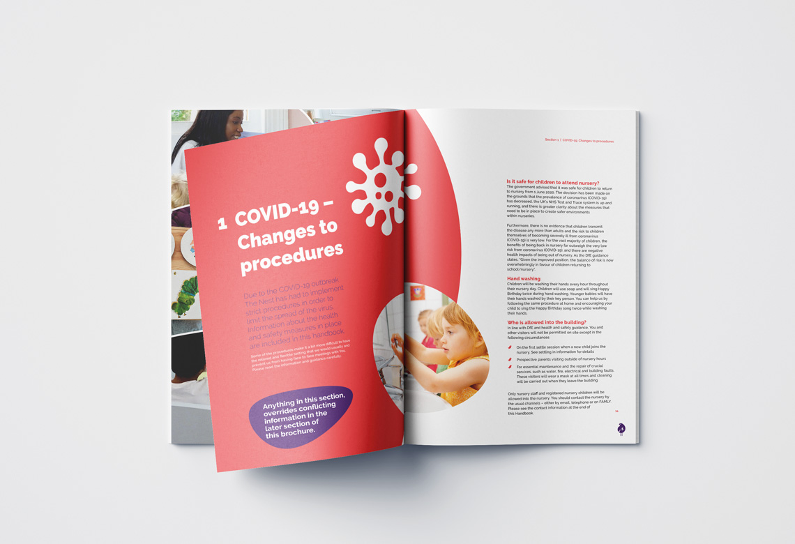
I created a new brochure for The Nest, a day nursery and pre-school based in Brighton. The brochure was to inform families of new starters about the rules and requirements which they and their children would need to know, prior to starting.
They provided me with the text and some pictures of their nursery to start with. I made the brochure easy to read, using clear fonts, bright pictures and white space to break up the text, and friendly curves.

The final design used colour to differentiate the sections, keeping related information together. The curved pictures give a friendly feeling to the document, and the white spaces help keep the text easy to read, preventing it from overloading the reader.
I added stock photos and illustrations throughout the document, giving the final document a bright and modern feel.

"Mark created a lovely 40-page brochure for us. Fast and professional."
Debbie T, The Nest Day Nursery & Pre-School