April 2026
For this project, I created a full 42‑page brochure in the standard REC design style, but with a fresher, more modern look. The brief was to keep things clean, approachable and easy to navigate, even with a huge amount of data, charts and narrative content.
The document needed to feel friendly and human, so I built a layout system that balanced REC’s established brand with a lighter, more contemporary feel. Think open spacing, clear hierarchy, warm colour accents and a visual rhythm that keeps readers moving through the pages without feeling overwhelmed.
A big part of the job was designing a full suite of graphs, charts and data visuals. These weren’t just dropped in, each one was styled to match the new look, with consistent typography, colour usage and iconography. I also created a set of simple illustrations and sourced stock imagery to support the storytelling and break up the heavier sections.
The final brochure is structured, polished and professional, but still friendly and easy to read. It’s the kind of document that invites people in rather than intimidating them, exactly what the client wanted.
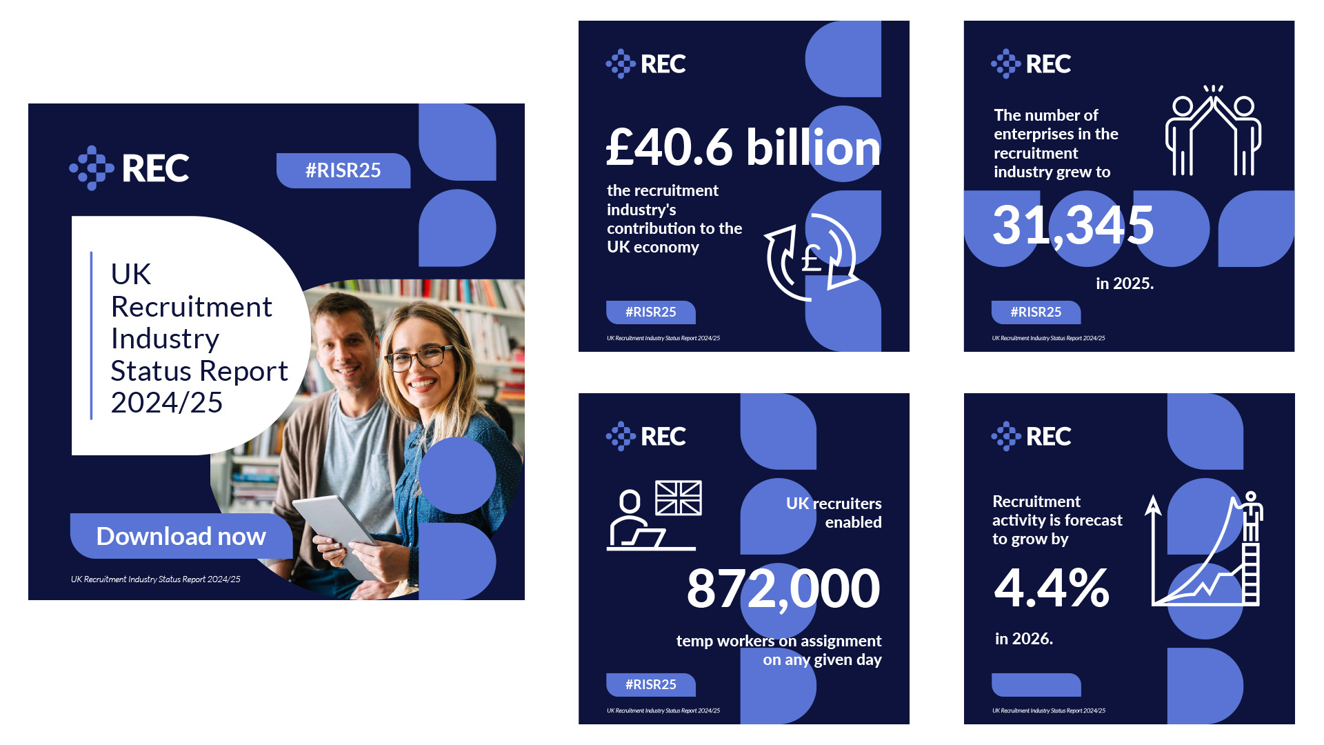
To support the launch of the report, I also designed a set of social media templates that carried the new look across into REC’s online channels. These were built to be flexible and easy for the team to update, bold headlines, clear data callouts, simple illustrations and strong colour accents. The aim was to make the key insights instantly shareable while keeping everything visually consistent with the main brochure.